티스토리 뷰
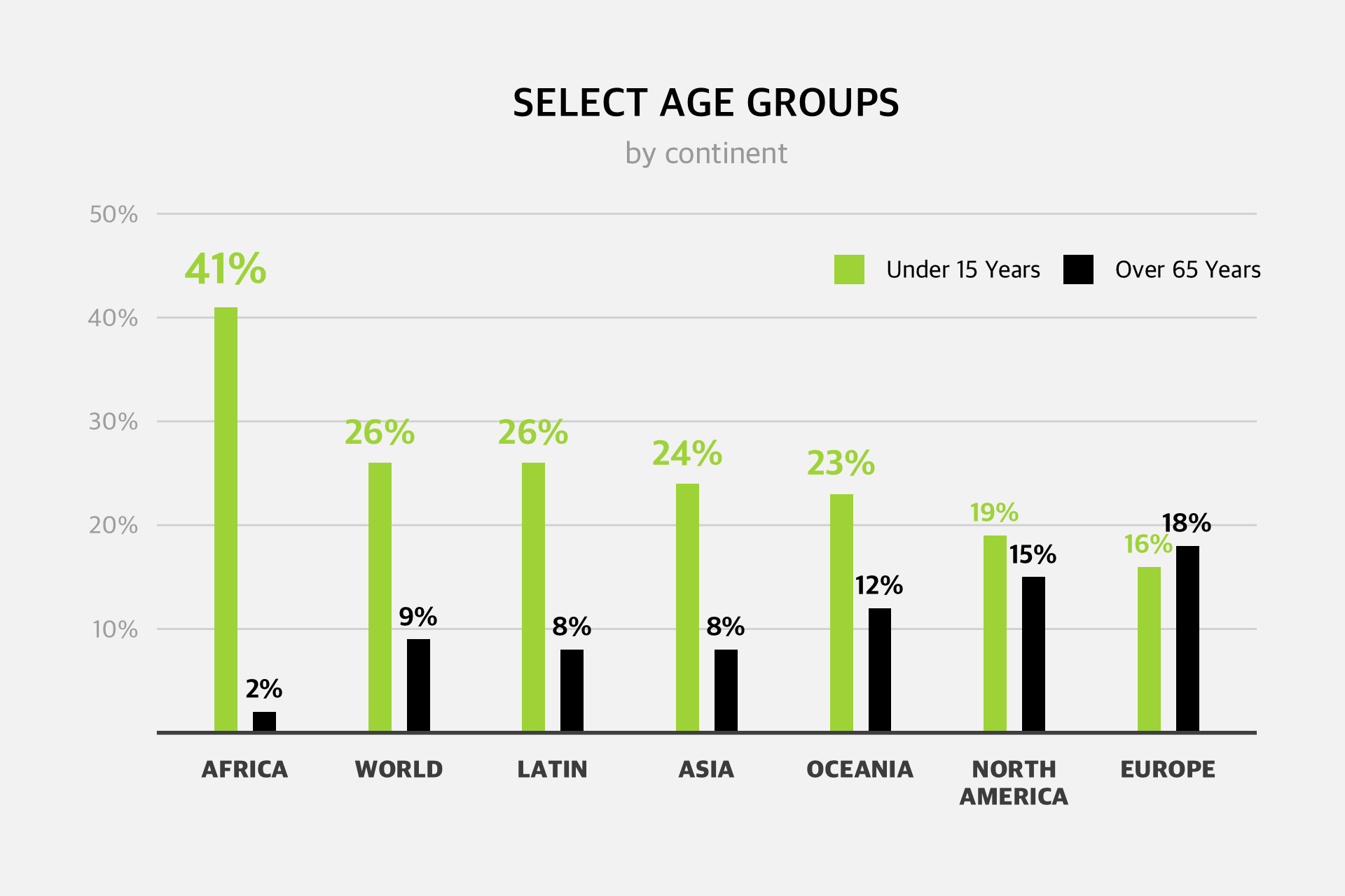
아래 그림은 인터넷을 서핑하다 발견한 그래프 이미지 이다. 해당 이미지를 ggplot2 로 대략 따라해볼까 한다. 그룹형 막대그래프이고, 막대그래프위에는 숫자가 표현되어 있고, 범례는 우측상단에 표시, 타이틀은 중앙상단쪽에 배치되어있다. (이미지는 잘몰라서 패스)

그래프를 표현할 데이터를 만든다. 다행히 이 예시는 숫자가 다 차트에 표현되어 있어서 쉽게 만들수 있었다. 그리고 차트를 자세히 보면, 차트가 길때 막대그래프위에 숫자의 폰트크기가 좀 크고, 수치가 작으면 폰트크기가 작은것을 구현하려고 임의의 함수를 만들고, map 함수를 이용해서 font size 를 담을 s 컬럼을 추가했다.
font_size = function(value){
  if(value > 30){
    5
  } else if(value > 20){
    4
  } else {
    3
  }
}


tb = tibble(
  x = rep(1:7, 2),
  y = c(c(41, 26, 26, 24, 23, 19, 16), c(2, 9, 8,8, 12, 15, 18)),
  z = rep(factor(1:2, labels = c("Under 15 Years", "Over 65 Years")), each = 7)
) %>%
  mutate(s = map_dbl(y, font_size))

  # A tibble: 6 × 4
      x     y z                  s
  <int> <dbl> <fct>          <dbl>
1     1    41 Under 15 Years     5
2     2    26 Under 15 Years     4
3     3    26 Under 15 Years     4
4     4    24 Under 15 Years     4
5     5    23 Under 15 Years     4
6     6    19 Under 15 Years     3
그 다음에 할일은 그래프를 그리기만 하면 된다. 막대그래프에서 그룹형으로 만들때는, position_dodge() 함수를 쓰면된다. 막대그래프끼리의 간격을 0.5정도 두면 살짝 떨어지게 된다. 폰트크기도 앞서 정한 폰트크기 수치대로(s 컬럼) 잘 표현되는 것을 볼 수 있다. geom_text 에 size 옵션을 사용하면 된다.

ggplot(tb, aes(x,y, fill = z)) +
  geom_text(aes(x = x, y = y, label = paste0(y, "%"), color = z),
            vjust = -0.7,
            position = position_dodge(width = 0.5),
            family = "AppleSDGothicNeo-ExtraBold",
            size = tb$s) +
  geom_col(position = position_dodge(0.5), width = 0.3)  +
  scale_x_continuous(breaks = 1:7,
                     labels = c("AFRICA", "WORLD", "LATIN", "ASIA", "OCEANIA", "NORTH\nAMERICA", "EUROPE")) +
  scale_y_continuous(breaks = seq(10,50,10), limits = c(0,50),
                     labels = paste0(seq(10,50,10), "%"),
                     expand = expansion(c(0,0.05)))
이제는 디자인만 손보면 된다. 좀 걸리긴 했지만, 아래가 ggplot2 로 완성한 그래프이다. 보다시피 폰트, 색상, 축 등 조정을 하면 인터넷에서 가져온 차트와 얼추 비슷한 차트를 만들 수 있다.
ggplot(tb, aes(x,y, fill = z)) +
  geom_text(aes(x = x, y = y, label = paste0(y, "%"), color = z),
            vjust = -0.7,
            position = position_dodge(width = 0.5),
            family = "AppleSDGothicNeo-ExtraBold",
            size = tb$s) +
  geom_col(position = position_dodge(0.5), width = 0.3) +
  scale_x_continuous(breaks = 1:7,
                     labels = c("AFRICA", "WORLD", "LATIN", "ASIA", "OCEANIA", "NORTH\nAMERICA", "EUROPE")) +
  scale_y_continuous(breaks = seq(10,50,10), limits = c(0,50),
                     labels = paste0(seq(10,50,10), "%"),
                     expand = expansion(c(0,0.05))) +
  scale_fill_manual(values = c("#ACD848", "#000000")) +
  scale_color_manual(values = c("#ACD848", "#000000")) +
  labs(title = "SELECT AGE GROUPS",
       subtitle = "by continent") +
  theme_minimal(base_family = "AppleSDGothicNeo-Medium", base_size = 13) +
  theme(
    plot.margin = margin(1,1,1,1, "cm"),
    plot.title = element_text(family = "AppleSDGothicNeo-Bold",
                              hjust = 0.5, size = 13),
    plot.subtitle = element_text(hjust = 0.5, size = 10, colour = "#A9A9A9"),
    axis.title = element_blank(),
    legend.title = element_blank(),
    legend.text = element_text(size = 8),
    legend.key.size = unit(3, "mm"),
    legend.position = c(0.8,0.85),
    legend.direction = "horizontal",
    panel.grid = element_blank(),
    panel.grid.major.y = element_line(colour = "#d9d9d9", size = 0.2),  #ECECEC
    axis.line.x = element_line(colour = "#505050"),
    axis.text.x = element_text(size = 8,
                               family = "AppleSDGothicNeo-Heavy",
                               margin = margin(2,0,0,0, "mm")),
    axis.text.y = element_text(colour = "#AEAEAE", size = 8)
  )
공지사항
최근에 올라온 글
최근에 달린 댓글
- Total
- Today
- Yesterday
링크
TAG
- vagrant
- 셀프개통
- 마인크래프트
- Oracle
- MySQL
- heroku
- python
- 아이맥
- Google Chart Tools
- 도넛차트
- MongoDB
- 막대그래프
- docker
- 알뜰요금제
- github
- 맥북
- ggplot
- SVN
- ubuntu
- javascript
- ipTIME
- ktm모바일
- R
- 이클립스
- MyBatis
- ggplot2
- 자급제폰
- eclipse
- java
- Spring
| 일 | 월 | 화 | 수 | 목 | 금 | 토 |
|---|---|---|---|---|---|---|
| 1 | 2 | 3 | 4 | |||
| 5 | 6 | 7 | 8 | 9 | 10 | 11 |
| 12 | 13 | 14 | 15 | 16 | 17 | 18 |
| 19 | 20 | 21 | 22 | 23 | 24 | 25 |
| 26 | 27 | 28 | 29 | 30 | 31 |
글 보관함